Why I'm Using Bootstrap In 2020
I recently needed to redevelop our agency’s website. We moved from Drupal to Jekyll in an effort to keep things simple. However, we didn’t end up changing the design much. The original design was totally custom, which meant it was up to me to create a typography system, layout system, as well as style any and all elements and components that could exist. As a web developer I’m used to this, but often overlook the complexity and redundancy involved in making the same decisions over and over again. Because of this, I decided to reach for Bootstrap, which has matured a lot in this newest release. Below are several reasons why I will continue to use Bootstrap in 2020.
Utility Classes and Variable Overrides
I had convinced myself that Bootstrap was not able to be customized enough to create a unique design. In the past, that might have been true, but thanks to utilities and variable overrides I was able to recreate a custom theme without breaking away from the framework.
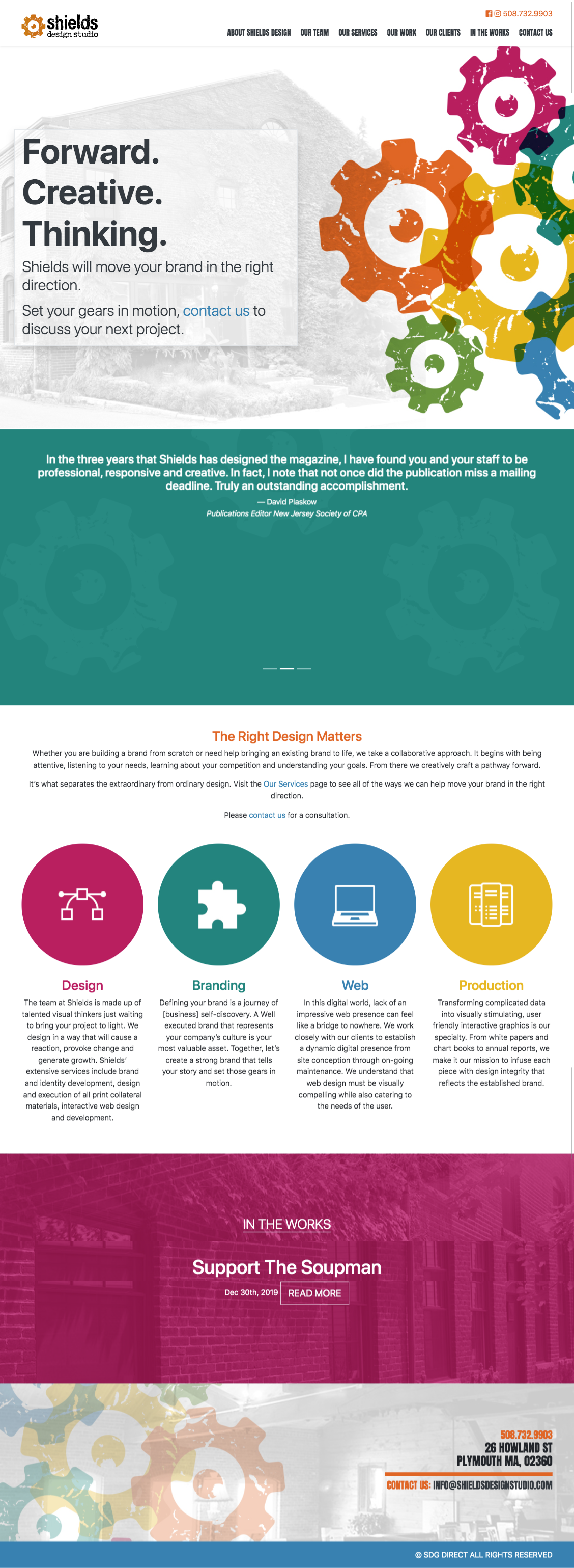
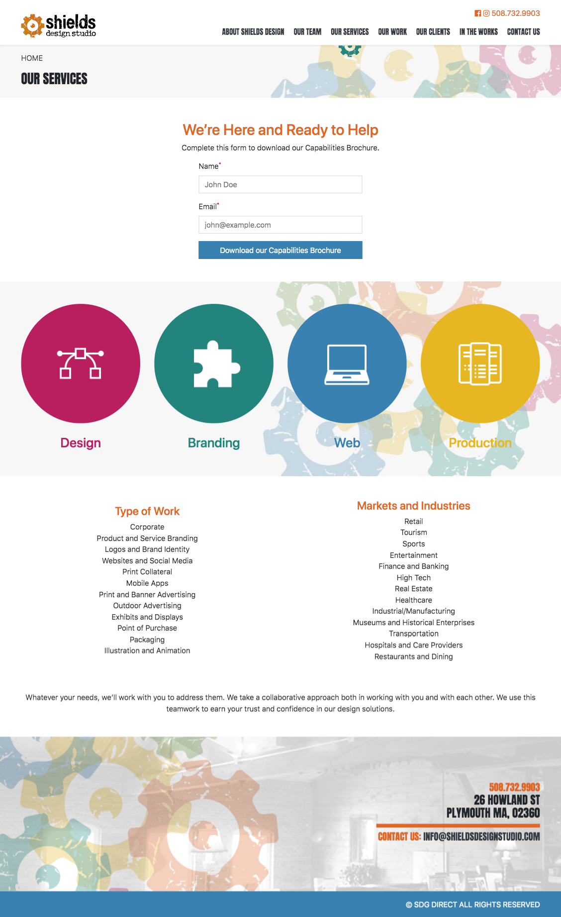
For context, below are screenshots of some of the more complicated layouts.
Below is all the custom css I needed to write, in addition to the variable overrides.
My Custom CSS
.carousel**container .carousel {
  max-width: 788px;
}
.carousel**container {
  background: rgba($secondary, 0.25);
}
.grid img {
  @extend .img-fluid;
}
main {
  h1,
  h2,
  h3,
  h4,
  h5,
  h6 {
    @extend .text-base;
    @extend .text-secondary;
  }
}
.full-width {
  width: 100vw;
  position: relative;
  left: 50%;
  right: 50%;
  margin-left: -50vw;
  margin-right: -50vw;
}

.reveal-item {
  .reveal-item__title-wrapper {
    @include media-breakpoint-up(md) {
      z-index: 2;
      transform: translateY(-100%);
      transition: all 0.15s cubic-bezier(0.075, 0.82, 0.165, 1);
      position: absolute;
      display: flex;
      flex-direction: column;
      align-items: center;
      justify-content: center;
      top: 0;
      right: 0;
      bottom: 0;
      left: 0;
    }

    h1,
    h2,
    h3,
    h4,
    h5,
    h6 {
      font-family: $font-family-base;
      text-transform: uppercase;
    }
  }

  &:hover,
  &:active,
  &:focus {
    text-decoration: none;
    .reveal-item**title-wrapper {
      @extend .bg-info;
      @include media-breakpoint-up(md) {
        transform: translateY(0);
        transition: all 0.15s cubic-bezier(0.075, 0.82, 0.165, 1);
      }
    }
  }
  .reveal-item**image {
    @include media-breakpoint-up(md) {
      position: absolute;
      top: 0;
      left: 0;
      right: 0;
      z-index: 1;
    }
  }
}

.image-ratio {
  height: 0;
}
.image-ratio--square {
  padding-top: 100%;
}
.image-ratio--rectangle {
  padding-top: 75%;
}
.image-ratio--narrow-rectangle {
  padding-top: 25%;
}

.text-base {
  font-family: $font-family-base;
}
.hero__content {
  background: rgba($white, 0.5);
}
main img {
  @extend .img-fluid;
}
.latest-post {
  min-height: 480px;
}
.navigation__link {
  font-family: $headings-font-family;

  &:hover,
  &:active,
  &:focus,
  &.navigation__link--active {
    text-decoration: none;

    &:after {
      content: "";
      display: block;
      height: 25px;
      width: 50px;
      position: absolute;
      background: url("/assets/img/shared/gear-half-green.svg") top center
        no-repeat;
      left: 50%;
      margin-left: -25px;
      top: 41px;
    }
  }
}
.testimonials**carousel {
  min-height: 480px;
}
.testimonials**gear {
  opacity: 0.05;
}
.testimonials**gear-1,
.testimonials**gear-3 {
  animation: spin * * clockwise 8s linear infinite;
  bottom: -25%;
}
.testimonials**gear-2 {
  animation: spin__counter-clockwise8slinearinfinite;
  top: -25%;
}

@keyframes spin**clockwise {
  100% {
    transform: rotate(360deg);
  }
}
@keyframes spin**counter-clockwise {
  100% {
    transform: rotate(-360deg);
  }
}
My Variable Overrides
// Override Custom Variables From _sass/bootstrap/_variables.scss

// Color system
$blue: #3881b1;
$red: #b91e5e;
$orange: #e06625;
$yellow: #e7b721;
$green: #6a973f;
$teal: #18847c;
$gray-900: #212529;

$secondary: $orange;
$info: $teal;

// Breadcrumbs
$breadcrumb-bg: transparent;
$breadcrumb-divider-color: $gray-900;
$breadcrumb-active-color: $gray-900;

// Options
$enable-responsive-font-sizes: true;
$enable-rounded: false;
$breadcrumb-divider: quote("»");

// Typography
$headings-font-family: "Anton", sans-serif;
In my opinion, I was able to develop a very unique design that does not resemble the stereotypical cookie cutter Bootstrap look and feel. By simply changing the color and font variables and leveraging utility classes, I was able to design the majority of the site. If I needed even greater flexibility, I just added my own styles, which only amounted to an extra ~155 lines of .scss.
Typography System
Consistent and hierarchial typography is core to every website, yet often overlooked. Creating a maintainable and consistent typography system is no small feat, and is easy to get wrong. Fortunately Bootstrap ships with an excellent typography system. What I really appreciate is that there is a setting which allows for responsive font sizes, which allows text to scale more naturally across device and viewport sizes. Finally, if the default settings don’t meet your needs, you can just override default typography variables.
Accessibility and Consistency
Accessibility is more than just adding alt descriptions to images and using semantic markup. There is a lot to get wrong, especially when trying to build common features such as tabs and modals. I used to let my ego get the best of me, and thought that using a framework to do this was lazy. Now I realize it’s smart, if not the only appropriate thing to do. Components like dropdowns, collapse, and modals are battle tested. Not only are they guaranteed to be accessible, but they’re also guaranteed to work consistently across all supported browsers and mobile devices.
Styles All Elements
Most designs I receive don’t account for all HTML elements. For example, imagine you’re building a WordPress site and hand it off to the client. The client creates a new page and adds a <table> and a <blockquote>. If you weren’t using Bootstrap, you would have had to create styles for these elements even though they were never explicitly given to you in a design. It might seem trivial, but this has burned me in the past. Along with styling all elements, Bootstrap also consistently styles common elements you would need to style anyways, like buttons and forms.
Ships With Features You Might Need Later
One of the challenges with web development is that it’s impossible to account for anything and everything upfront. The first iteration of a website may not need to have a carousel or tooltips, but these features might need to be added later. It’s a heck of a lot easier to have them tucked away rather than have to roll them out from scratch.
Performance
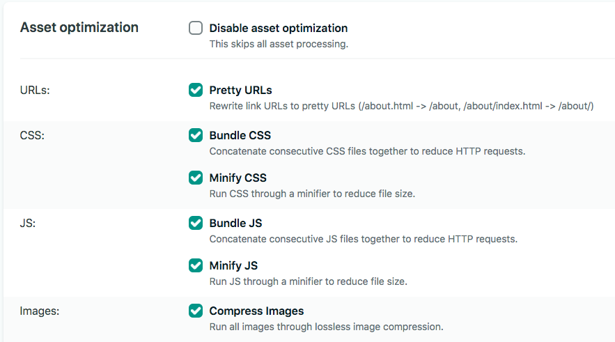
Bootstrap has a reputation for being bloated. However, if you use their cdn you can dramatically reduce the file size. I’m hosting our site on Netlify, and am using their asset optimization.
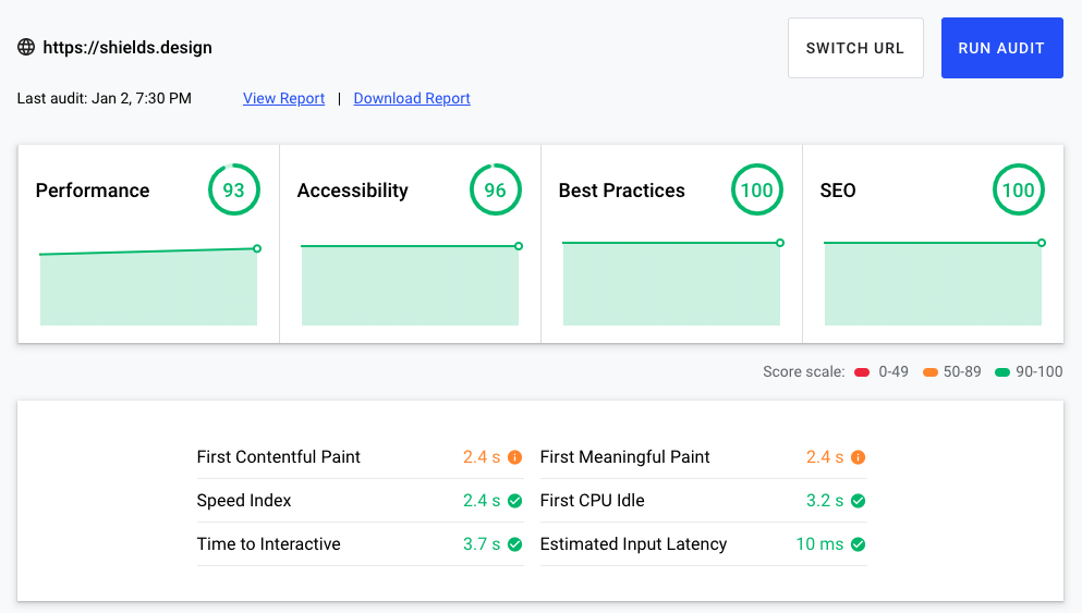
This reduced my CSS into a single 30.0 KB file, and my JS into a single 51.5 KB file. When I run my site against web.dev I score pretty well.
tl;dr
The newest version of Bootstrap is highly customizable and scalable. It’s battle tested, accessible, and is a solved problem for most websites.


